Purpose:
The purpose of this website is to create a platform where I can share my photography. In the business of photography, it is crucial to have a place online where people can view your work. By visiting my website, potential clients or employeers can become familiar with my style of work and past projects.
Audience:
The main target audience of this website will be people viewing my concert photography. After recently photographing shows in the pop-punk scene, many of my viewers will be searching for a place to see my content from those projects. My photography can reach people of all ages, however, many of my viewers will be in the 16-27 age range. My photography is not gender specific and can also resonate with people all over the world. However, I have seen a consistent interest in people from The United States and The United Kingdom. As I continue to advance my photography career, one of the main target audiences will become employeers. As I send my website to potential places of employment, they will want to see a professional portfolio demonstrated through my website. It will be very important that my website is accessible by both computer and mobile devices, due to the increase of sharing work through social media.
Audience's Interests:
Questions asked to potential audience:
How often do you look at concert photography websites?
33.3% said a few times a month
33.3% said once a week
13.3% multiple times a week
How important is concert photography to you?
60% said very important
40% said somewhat important
Where do you see concert photography?
100% said photographer's Instagram
86.7% said Twitter
53.3% said photographer's website
How do you like to see photography displayed on a webpage?
33.3% said galleries
33.3% said one-by-one, side by side
33.3% said one-by-one, down the page
What design elements do you think are important for a photography website?
Links, clean design, watermark, signature style
Well-organized website, user friendly, easy to browse photos
Tiled overview page but also have tabs for specific gallaries
Easy navigation, contact details, different samples of work, photos take up majority of page's focus
Besides the photos, what makes a photography website stand out to you?
Looks professional
Clear layout with contact information for the photographer
Clearly marked social media links, get to know the photographer better
Good web/graphic design, front page
Reference Websites:
Thomas Falcone's website: For design, I enjoyed the use of galleries on this website. Galleries make it easier to sort through related images.
Ryan Wantabe's website: For design, I really enjoyed Ryan's header at the top of his page. I think having a simplitic header at the top of the page is how I want to construct my navigation tabs.
Ashley Osborn's website: For color scheme, I like the simple black and white design of her site. I think black and white designs make the colors in the photography stand out on the page.
Adam Elmakias' website: Even though Adam is one of my favorite photographers, I do not like the design of his website. I think there are too many distracting elements on his website. I think the header at the top and all the additional links and black design bars throughout the page are very distracting. Therefore, I will try and keep my website very simple to keep the focus on the photography.
Joshua Halling's website: I enjoyed how Joshua kept a consistent, unique font throughout his website. I also enjoyed how his Index was visible once you scrolled to the end of every page. This gives viewers the opportunity to continue to sort through the site after looking through galleries.
Presentation Information:
Synopsis:
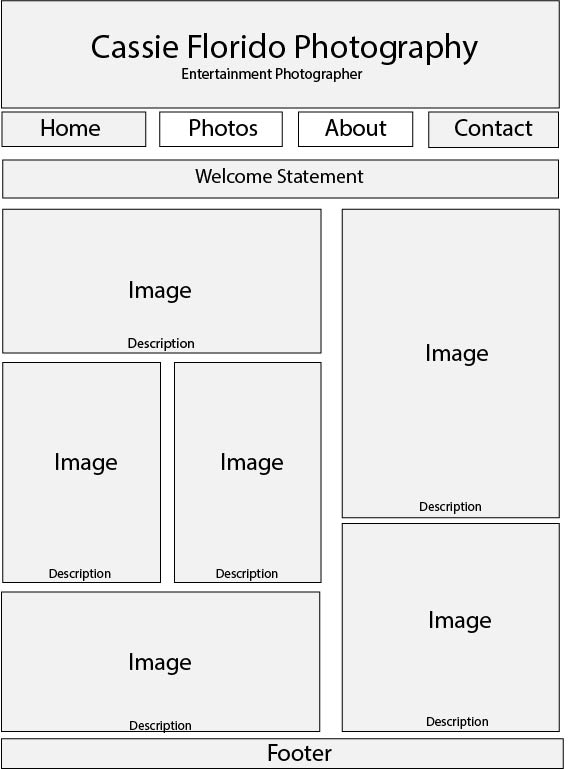
After looking at my audience's responses, I think organizing the photos side-by-side would be the best method. Even though the audience's answers for the layout of the photography was exactly the same for each option, I think side-by-side is the best way to have a clean, organized layout. I originally wanted to organize my photos in galleries; however, I think users feel galleries are hard to navigate through. I will have a header at the top of my website that contains links to pages throughout my site. My audience thought having contact information is extremely important, therefore, I will make a page that contains all of my contact information and social media links.
Text outline:
The following is an outline of how I will organize each page on my website.
Homepage: Banner with full name and logo, description of photography, few large photos arranged side-by-side as introduction to site, table with links to pages within site, Footer: last revised date/most important contact information
Photos page: organized by concert or band, photos fitted side-by-side, only put best photos to avoid overcrowding, Footer: last revised date/most important contact information
About page: photography background, past clients/positions, Footer: last revised date/most important contact information
Contact information: links to social media, email, phone number, Footer: last revised date/most important contact information
Organization Rationale:
The organization of my photography is the most important design element of my website. If viewers cannot navigate the photography quickly and efficiently, my website is not fulfilling it's main purpose. Therefore, instead of having my audience click through each individual image, I have my photos in a side-by-side layout for easier viewing. I also put different pages, such as contact and personal information, on separate pages in order to not have that information cluttering up the photography pages.
Media:
All of the media on this website will be my own personal media. The photography chosen will be my personal best work. The photography has been through post-production in Lightroom. The images will have captions of who is in the photo and when it was taken.
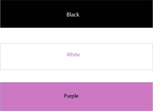
Color scheme:
The background of my webpage will be white. All text on the page will be black. Any accent colors will be in a light purple color, which will only be used when neccesary.
Here is the wireframe for my site:Wireframe.

